
Role
Services
Team
Timeline
Visit
Student on board ⚠️ - Quizlet Internship 2022
Hop onboard as you don't want to miss this. Learn how I was able to contribute to Quizlet's most important page.
Project Overview
During my summer internship, I was fortunate to work with the Set Page team at Quizlet. The set page is Quizlet's most visited page, but it has been going through changes to prepare for the upcoming back-to-school season.
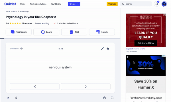
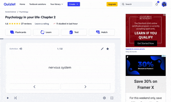
Quizlet rolled out Mini Flashcards to replace Study Preview. While Study Preview had flaws, it was great at activating students into studying.
Final Product


Role
My role in this project was to design explorational solutions and prototypes that will be A/B tested to replace the current set page onboarding. Along with looking at previous research, I also audited Quizlet's existing solution.
Problem
As mentioned, the set page is Quizlet's most visited page, but it's also its most profitable page. Thus, if alpha tests for Mini Flashcards come back with concerning results, we must be prepared to implement a new solution to increase those metrics.
- How can we create an intuitive onboarding process that prompts learners to interact with Mini Flashcards?
What does Quizlet's current onboarding look like?

Goals
Our goals for mini flashcards onboarding are to show, not tell, what studying on Quizlet is all about. How can we do this? Hint to learners on how to interact with the card without having them engage with it. This solution will help show the value of mini flashcards on their first experience.
From a business standpoint, a learner achieves study activation once they click one flashcard. So, just once is all it takes. But what's the minimum we need to do to get them to click one more card?
The overarching goal for Quizlet is to build a delightful product experience that helps students get and stay motivated throughout their studying to achieve their learning goals.
Design Process
Jam Session

My design mentor, Mike, and I took some time early in the process to brainstorm different solutions together. I drew out some of my initial ideas and he added to them. Because I was at Quizlet for about a week at the time, I asked questions to gage some limitations, especially since he designed Mini Flashcards.
Interactions
Looking at previous research, Study Preview helped get more visitors from Google searches and led to a four to nine percent increase in learner retention. In addition, Study Preview showcased activities that help students learn and ace their tests.

I noticed an improvement in making the flashcards animation feel more natural as I played with a deck of physical flashcards mimicking how I might study with them. Currently, logged-out users who land on a set page see the following:
- The card flips once
- The card moved a little bit to the left
- One line of onboarding text
Here are some proposed solutions:
Shuffle

Tilt (Coded interactive solution)

Flip First

After feedback at Quizlet's bi-weekly design critique, I decided that Flip First was the right route. The animation was subtle but still noticeable and it felt playful. It was also described to be most like a deck of cards.
The flip with the added peek shows the users that cards have a term and definition side. It also shows that there are more flashcards to be studied. But I wanted to have the peek first and flip second as we want the user to flip back as their first action, ideally. This all goes back to the goal of "show not tell" what Mini Flashcards are all about.
Onboarding Text
Another challenge was trying to find a new home for onboarding text. While conducting user interviews for Mini Flashcards with my mentor, we noticed that students would click the directional arrows as a gesture to try to flip the card.
Iterations

The previous area displaying onboarding text is now home to direction buttons to help learners move through cards. Further, the white space under the flashcards has more interactive elements that limit space and hierarchy.
Outcome


Results
The interactivity portion of the Mini Flashcards onboarding solution has been moved out of scope for the back-to-school launch as the Mini Flashcards alpha test came back with promising results. Almost perfect. The number of flashcards flipped decreased. Based on the user interviews, we could hypothesize that the lack of onboarding text was the root of this issue.
A/B testing has just begun for my onboarding text solution, so I'll post numbers for that test here in a couple of weeks.
Additionally, success metrics to keep in mind are median questions viewed, median flipped questions, and total time studying.
